In early March we started the process of reviewing and testing the content of a chunk of the information advice and guidance on the Essex.gov.uk and Living Well websites. Last week we published the first batch of pages that went through that process. We’ve still got a mountain of content to get through: but what we’ve learnt so far will help us tackle it.
It’s been more than a simple rewrite. We call it content design and it involves establishing what the user needs are, how best to meet them, drafting content to do that, then testing it with users to see if it works, and changing it accordingly. It’s involved lots of people, including staff from within Essex County Council and a cohort of citizens to test the pages with.
Some of the first pages that went live were around paying for care.
This involved merging the content from 2 previously separate sections - charging for care and direct payments. It’s a service which over 19,000 residents use every year, so a fairly significant one.
What did we change?
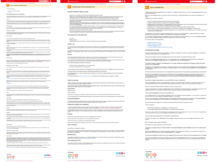
We merged the content from 2 previously separate sections — charging for care and direct payments. The services are part of the same paying for care process, therefore by bringing these sections together, we believe users will find it easier to navigate through the content.

We reduced the amount of content from 8,389 words over 22 pages, to 3,594 words over 15 pages. That doesn’t mean we’ve removed essential information: we’ve just tried to make it more digestible and easier for people to find what they are looking for.
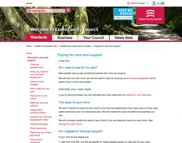
We changed the layout of the landing page which was previously not accessible and our research showed that users found it confusing. We have now gone for a more simple, linear layout loaded with text rather than images.

We also changed some of the language previously used. User testing highlighted that a number of people didn’t understand the term ‘domiciliary care’. Describing this as ‘care at home’ seemed to resonate more with users.
What were the challenges?
Paying for care — and the income thresholds at which financial support is available — is a complicated process that's heavily governed under the Care Act.
One of things that makes it so complicated is that everyone's situation is different — so it's very hard to provide people with exact information that will be relevant to their situation. The guidance is lengthy and daunting to trawl through. It’s exactly the kind of thing that as a user, you’re grateful if someone else has done the hard work to make it simple.
The project involved a number of different people from various teams, including the financial assessment team, adult social care and legal. This made it more challenging to coordinate times for everyone to meet and for people to review content.
There’s a few things that we’d have liked to have done: the original plan was to have the direct payment pages nested at a lower level — meaning the left hand navigation wouldn't look so long, but the limitations of the technology platform meant this wasn’t achievable within the scope.
Since then we’ve updated many more pages of content on Living Well Essex, and in most cases made the pages much shorter and — hopefully — easier to read. On average we’ve reduced content (defined by number words on page) by 80% and decreased the number of pages by 47%.
What’s next?
Now the content is live, the idea is not just to publish and forget. The next milestone for us is 6 weeks after the pages have gone live, when we will look at the analytics information (data about how people interact with pages) and asses the page’s performance against various criteria (things like time on page and ‘bounce’ rate). And then we’ll try and improve it and continue the cycle. This piece of work will also feed into our work on developing a prototype for the Essex.gov.uk project.
We’ve learnt a lot along the way which should help us publish redesigned content quicker, and get into a rhythm of publishing regularly, at pace. One of the ways we think we can start to do this is to communicate how we work a little more effectively to internal subject matter experts. To this end we’ve produced a guide to content owners about the way we work, and how we can make it easier for them to help us. Like our content, we’ll improve it as we go.
Leave a comment