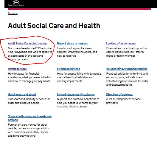
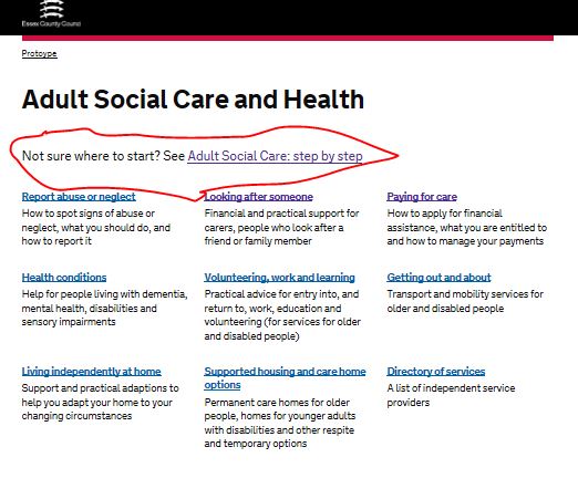
One of the tools we developed was a ‘Step-by-Step’ guide about adult social care. This had tested really well, so we decided to place a link to it on the top of the landing page for Adult Social Care. But when we tested with users, they struggled to find it.
We wanted to assess whether changing the placement of the step-by-step made it easier for people to find.
In an online test, participants were shown the Adult Social Care Landing Page and asked where they would look for information to help with this task:
‘Your father has been unwell. You want to find out what Council support is available to him, and what the process would be to access this. Where might you look to find this information?
Different people actually saw four different versions of the web-page –like those shown below:


What we found
When shown the version at the top, almost three in four people clicked on the ‘Step by Step’ link (71%). When shown the version on the bottom, no one chose this option. From this and from other face to face testing, we think that people expect to find information in the ‘boxes’ on the page, so they ignore the content at the top.
This will be important to bear in mind as we develop the website further.
Leave a comment