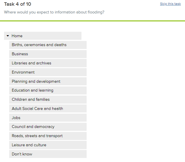
We used website analytics and other research to generate new navigation headings for the ECC website Homepage. We needed to test how service users responded to these headings and whether they made website content easier to find. Here's what we found.
During an online test, participants were assigned a series of tasks, like:
‘Where would you expect to find information on school closures?
‘Where would you expect to find out how to apply for a Blue Badge?’
Participants were then presented with the new navigation headings, such as ‘Education’, ‘Adult Social Care and Health’, or ‘Environment’, and asked to identify the heading they believed would help them with that task.

Each person saw 10 of a possible 50 tasks: more than 200 people took part in this test.
What we found
Finding 1: People chose expected headings more than 80% of the time. They were confident in their responses too – participants responded in less than ten seconds in most cases.
What we will do as a result: Nothing – this was an encouraging finding, and we can improve on this further by addressing other findings (see below).
Finding 2: People sometimes chose unexpected headings (in 15% of cases).
What we will do as a result: We will place links to some content under more than one heading, so that people can find what they need no matter where they look.
Finding 3: Occasionally, people did not know which heading to choose (in 5% of cases). For example, people did not know where to find information on Housing support. ….
What we will do as a result: We are reviewing our headings in accordance with these findings, and will test any changes we make.
Leave a comment