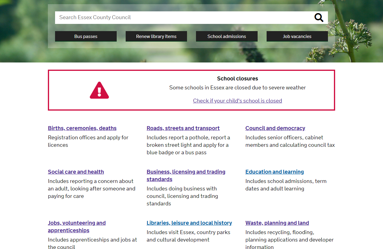
The Essex County Council website homepage is many residents first sight of our digital services. All other content hangs off the design and structure of this, so it’s important that we get it right. Here we share the first prototype of our homepage, and describe how we got there.

How we are doing it
We are redesigning the homepage based on what research and experience tells us works. This has included:
- reviewing homepage and search analytics, to learn what content is most important for our users
- drawing on insight and experience from government colleagues, like those in the Government Digital Services and multiple other local authorities
- observing our users interacting with the current homepage, and amended homepage prototypes, to identify what works for them and what doesn’t
The ECC Communications team helped us pull a first design: then we just needed to check that it worked!
Testing the design with users
As always, our user research panel helped us test our work, and provided critical feedback. We also hit the streets, gaining further insights from our residents face to face.
Using our design mockup, we tested how quickly and easily users could complete a range of tasks on the Homepage. We asked questions like ‘Where would you go to report a pothole?’ and ‘Where would you go to find Local Updates?’ We were reviewing whether people went to the right place and how quickly they got there.
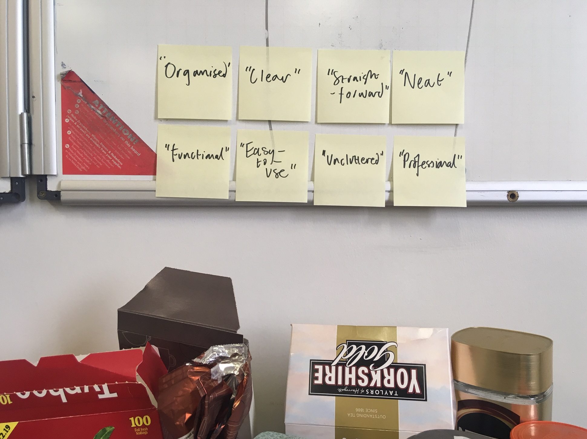
Overall, the first Homepage redesign tested well – response times were less than five seconds for most items (that’s pretty quick) and people found what they needed. People responded well to the look and feel of the page – the words they used to describe the page were aligned with our design objectives (clear, functional, professional).

We did notice that people struggled to find the e-newsletter sign-up – face to face feedback suggested that users expected to find this function in the same section as News items. We have since changed the position of this function to make it easier for users to find.
We also noticed that some of our section categories aren’t quite working – for example, some people expected to find information on jobs in Education and Learning. We have since changed the heading to Schools and Adult Learning, which better describes the content in this section.
Where we are now
Following testing and design revisions,the homepage prototype is working much better. It will soon be ready to take into Beta, pending some further internal work on content types, design, Information Architecture and search. We will continue to test with users through analytics and feedback.
1 comment
Comment by Yvonne Tunstill posted on
Excellent work and when finished I hope it will be a first in the country. You will have deserved it. I have loved helping.