The outdoors is for everyone.
At Essex Outdoors, our goal is to provide amazing experiences for everyone outdoors.
It could be for school groups, businesses or families.
We wouldn’t dream of turning anyone away because of a disability or impairment.
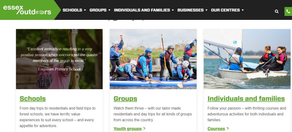
But often the first step to getting outdoors is going online to the Essex Outdoors website. It’s basically our shop window. So, if the site isn’t accessible for everyone, we’ve fallen at the first hurdle.
Know our users
We’re a fairly intrepid bunch. Our instructors include mountaineers, climbers and sailors, so we’re not afraid of doing a bit of exploring.
Our first task was to understand more about our users. We defined what they needed to do and mapped out how that matched up to the way we organise information on our site.
Designing around user need, instead of what we think they want, was a big step into the unknown. But knowing that we’d end up with something that people would use gave us a spring in our step.
Working iteratively
Just like with any of our activities, you can’t just choose a direction and stick to it. You need to check your progress and change course accordingly. For us, that meant testing early and throughout the process, then iterating.
This means you can make steady progress without worrying that what you’re working on has to be perfect straight away. Also it really challenges your assumptions, particularly the ones you didn’t even know you had.
We knew really early on that we wanted to design with accessibility at the heart of what we were doing. This was why we started to getting to know our users and testing the product straight away.
We found it not only made the site accessible to people with disabilities who might be using assistive tech like screen-readers but it made it better for all our users.
Ask for direction
With this in mind we got help. We turned to the expertise we have in-house in the Council right from the beginning.
The service design team were able to talk us through some of the common accessibility issues and how to avoid them. Doing this early meant we avoided costly and time-consuming work unpicking mistakes later on.
We also chose an external agency to build the site who we knew would design with accessibility at the heart of their process. Because we’d committed to this way of working, we were prepared for the extra thought, and cost, involved in designing like this.
Commercial sites can be accessible
Having this internal and external support was really important. In our line of work we’re used to high-wires, but when it comes to balancing the needs of a commercial website in a competitive market while also ensuring that you’re meeting your accessibility goals it can be slightly hair-raising.
We learned that by taking a bit more time and ensuring accessibility was the starting point of all our discussions, we could satisfy both these needs. This influenced our decisions around fonts, colours, navigation, branding, content and even the content management system we used.
We’re going to continue testing with users, including users with disabilities, to ensure we’ve got this balance right.
Accessibility as a guiding principle
It’s been a long journey for us. We’ve learned a lot. We hope by mapping it, we can help others along the same path.
You’ll definitely need the right tools and a lot of help and advice.
Most importantly, you should view accessibility as a guiding principle, not a burden, as you trek towards creating really useful and usable online services.
1 comment
Comment by Mr M P Cole Esq posted on
Great to read Dan and glad I could help a bit at the start with the procurement. Congrats to you, EO, and ECC service design team!